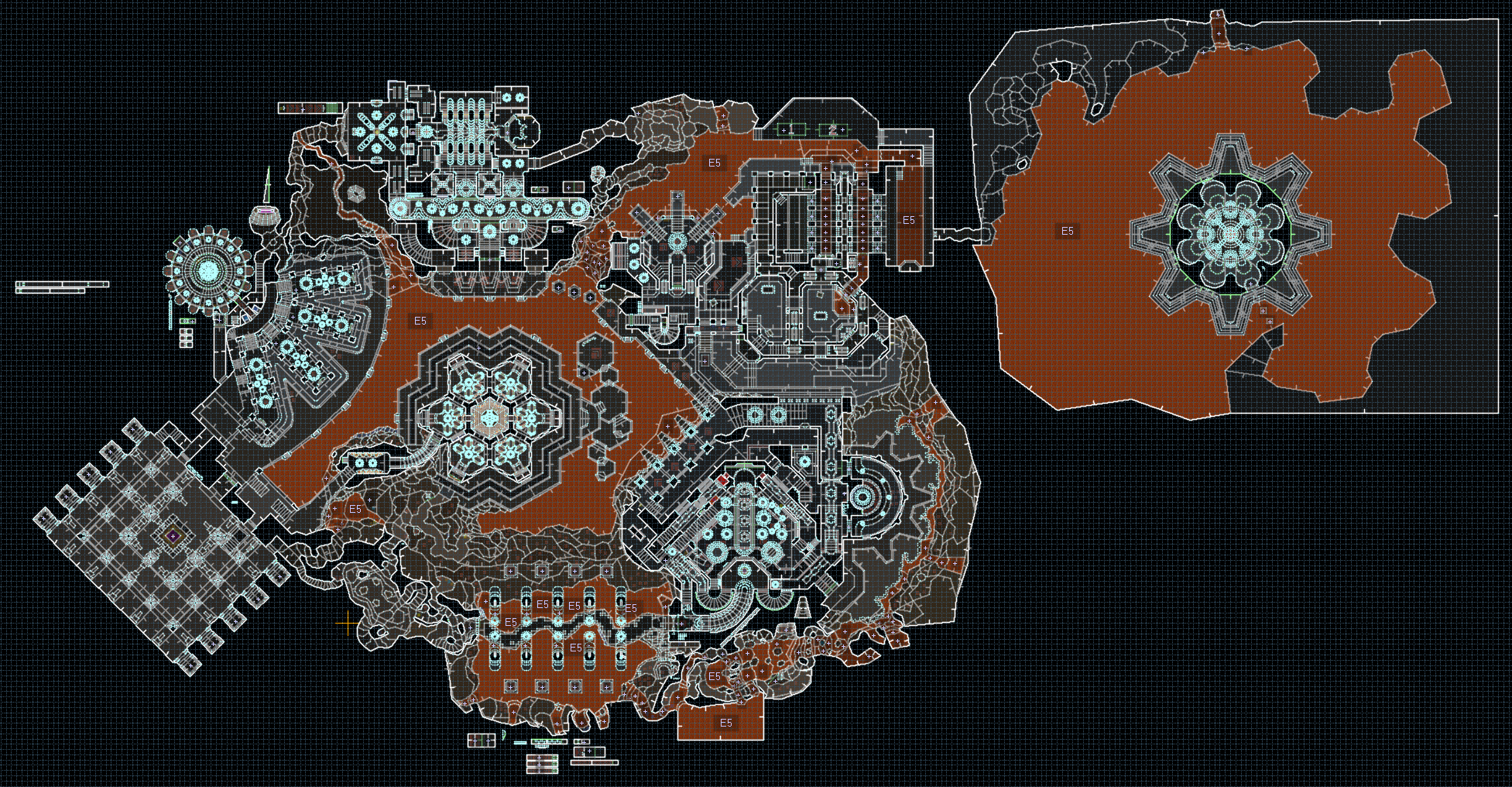
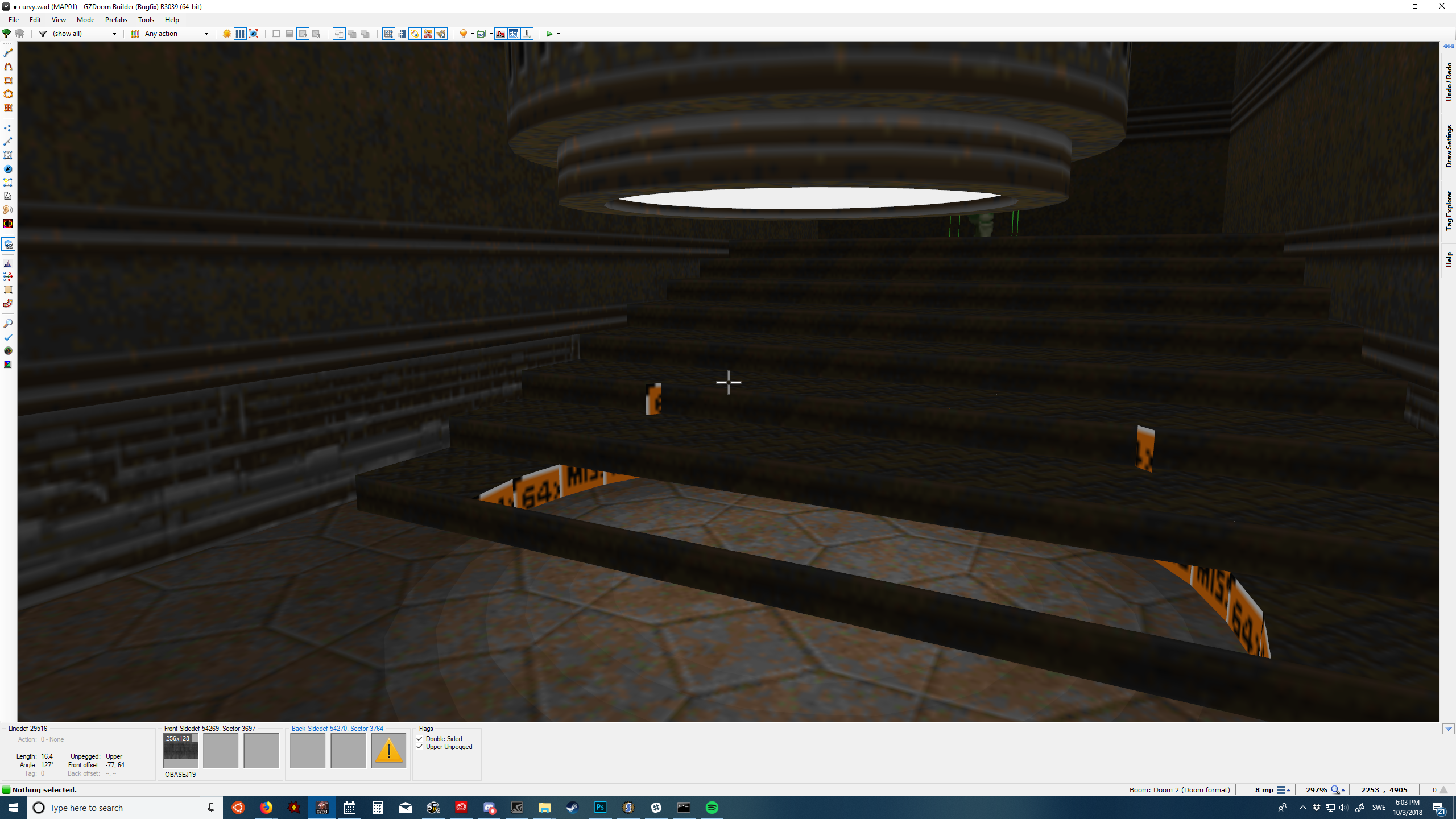
Eviternity II has now been out for some time, so it might be time to pull back the curtain a little bit regarding my map contribution. Note that this contains lots of spoilers so I strongly recommend playing the level for yourself first.
I doubt any single level merits this much text on its own, so I think the real value of this write-up isn’t the specific ideas for this particular level, but rather some insight to the overall process, what I struggled with, and my thinking about design in general.
The curse of the sequel
My level for the original Eviternity, Anagnorisis, gained a lot of attention for its scope and ambition. I felt that following Anagnorisis with a normal sized level for Eviternity II might lead to disappointment. So this time around I knew before placing a single vertex that the size and scope had to be very grand. That context made it rather daunting to start building, so I needed an overarching vision and concept to adhere to; I wasn’t trusting that chance and intuition alone would guide me to repeat the success of the predecessor.
I started building this far too close to the deadline, and it was by a good margin the level that missed our internal deadlines by the widest margin. Dragonfly ended up bailing me out by helping with several sections, detailed more below, and there’s a number of compromises in the level due to this time crunch. On the other hand, with infinite time at my disposal I would never get it done, so at least the level exists now.
Doom maps as art
When Sverre André Kvernmo released CABAL7.WAD in 1995, it made one of the strongest impressions on me that any single level has ever had. Its gameplay isn’t sensational by modern standards, but hit tab and WHOA. I knew from the day I saw that map—which would have been right around the time of its release—that Doom levels could be art.
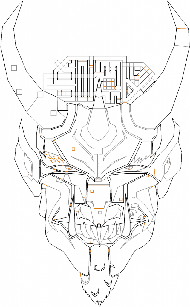
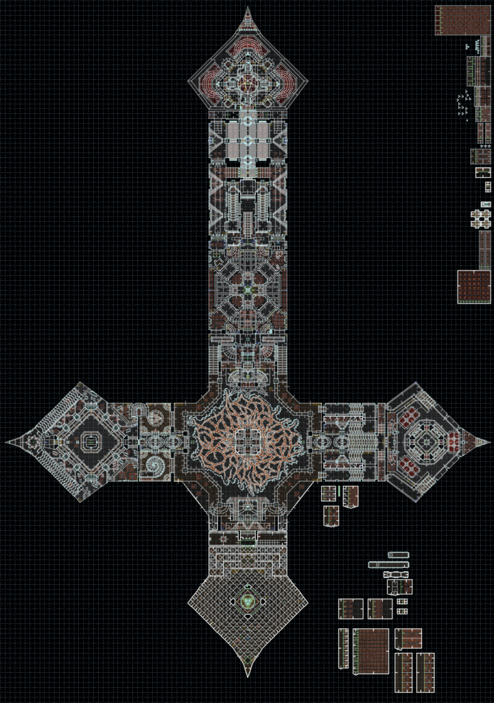
I can’t quite draw like Sverre can, but around 20-22 years ago I created a map for a never released project called Odium. My map, korset.wad (“The Cross”, in Swedish), is shaped like an inverted cross. It’s a fairly complete level but doesn’t play very well, so it’ll likely never be released. It was however directly inspired by the sector art of CABAL7 and a spiritual predecessor to Kenosis.
Combat design and the Doom zeitgeist
Eviternity got a bit of criticism for being too reliant on incidental combat rather than more deliberately sculpted fight setups, so one thing I wanted to change this time was to prove to myself (and everyone else) I could build more clever fights.
To hone that craft, I built several small setpieces in 2019-2022 where I tried to exploit monster behavior and Doom engine mechanisms to create something novel. Only after the fight felt somewhat interesting did I work on detailing and texturing. I’m a long way away from being a Ribbiks kind of mapper (or player) but I felt these exercises evolved my instinct as a designer tremendously. As Eviternity II was taking shape, I knew I wanted my level contribution to showcase this new approach.
The plan
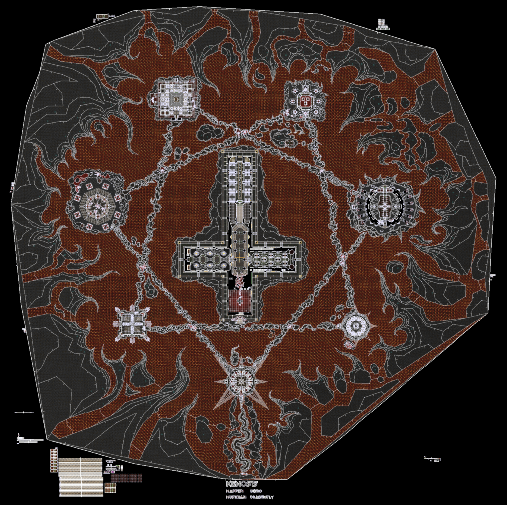
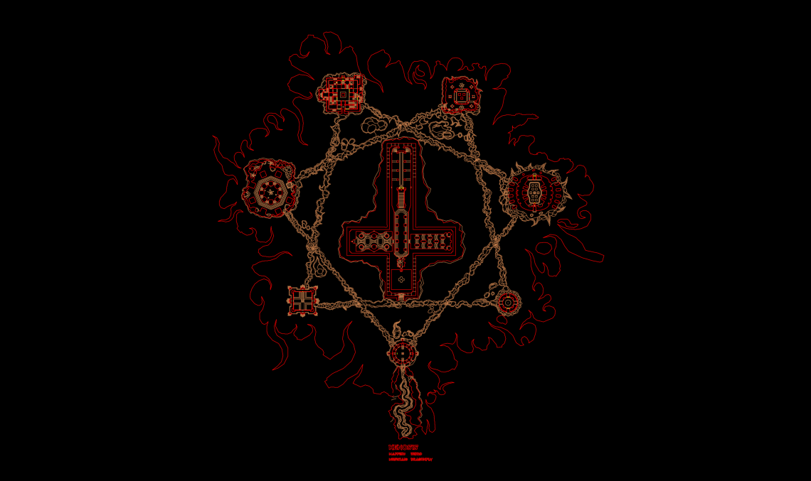
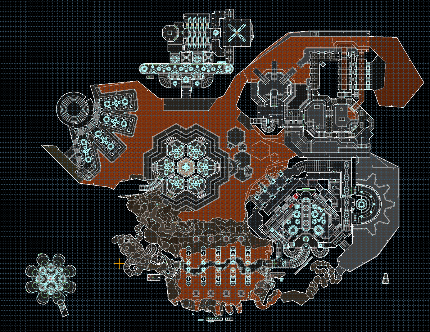
Anagnorisis had 3 color coded buildings—red, yellow, and blue—that each gave the player a key. In addition it also had orange, green, and magenta buildings, plus the final fight building. That makes for 7 in total, and I felt dividing a giant map up into roughly that many sections helped make the size manageable for most players. Any fewer and the individual segments might get too big, and getting into double digit sections will make it hard to remember what’s what. Combined with the idea of automap art I decided on a heptagram—two more points than a pentagram—with each point being a set piece or arena. An inverted cross building in the center would be the 8th, expanding the total by one from Anagnorisis.
At work (I have since quit this job), some time in 2021 I saw my colleagues work on special effects for the TV show Sandman, and in particular this shot grabbed my attention:
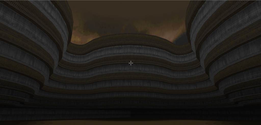
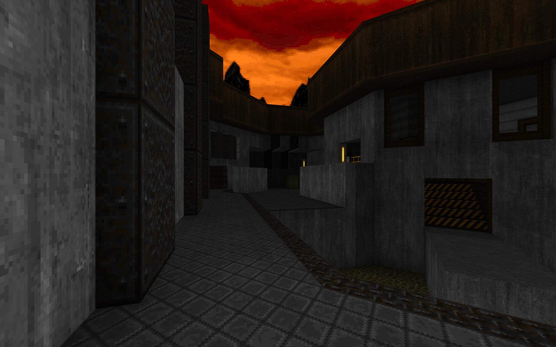
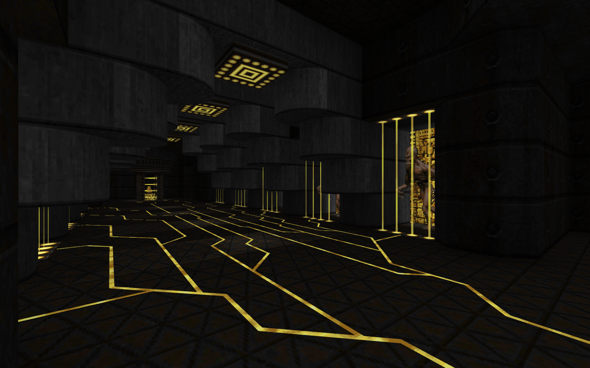
Translating this to Doom isn’t trivial, but I decided not to worry too much and make the lines forming the heptagram elevated walkways like this, surrounded by lava and a desolate hellish landscape.
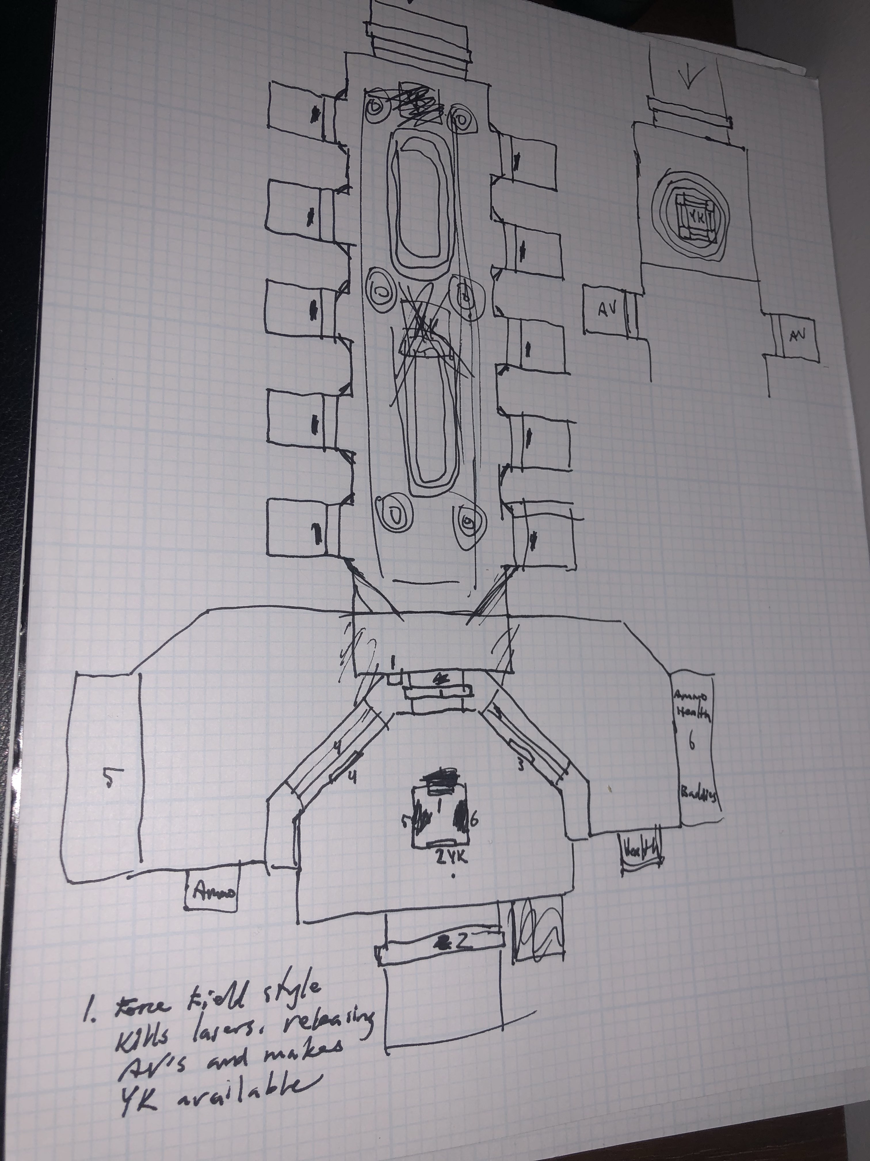
I wanted a bit more directorial control over player progression this time so I drew a plan on paper of a non-linear but more manageable flow compared to the ultra open predecessor, with notes on initial ideas for each setup. In the end the level actually follows most of this plan, including how you can initially go for chaingun or SSG, then a pick between two fights that each give the rocket launcher, then another two for plasma. It helped that had already built several little set pieces like the circular crusher, the initial berserk fight with the Arch-viles, and the winding path the player starts out on.
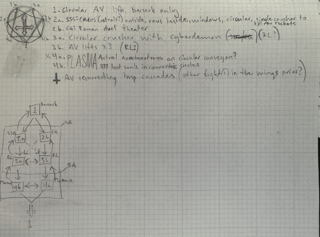
Now did I plan for the exact vibe that Kenosis ultimately has? Not at all. As much as I tried to maintain an unwavering vision of the final product, it still changed and shifted as I built it. So there’s still that element of compromise, serendipity, and ideas that take on their own life. But more on this later.
Building begins
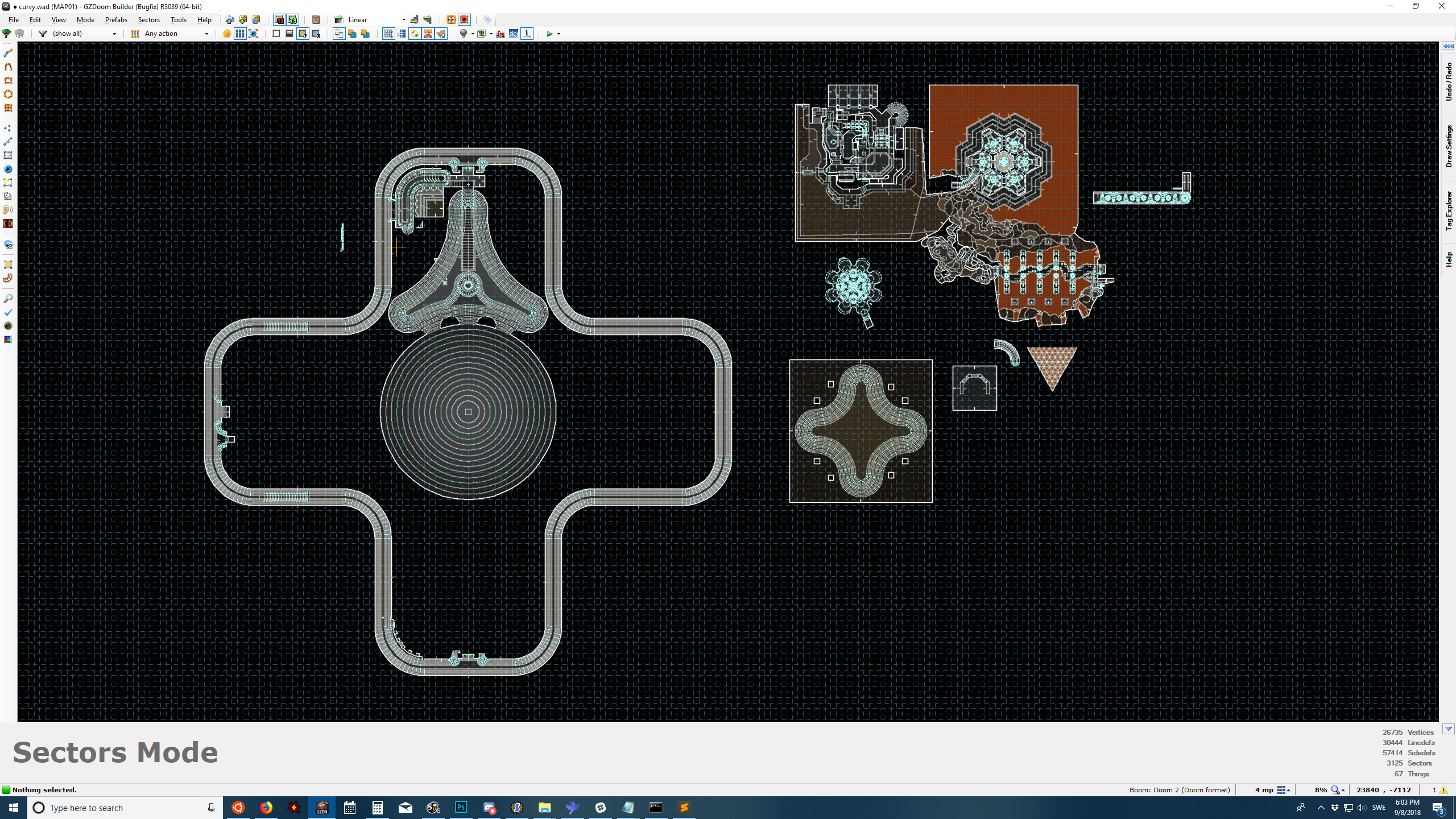
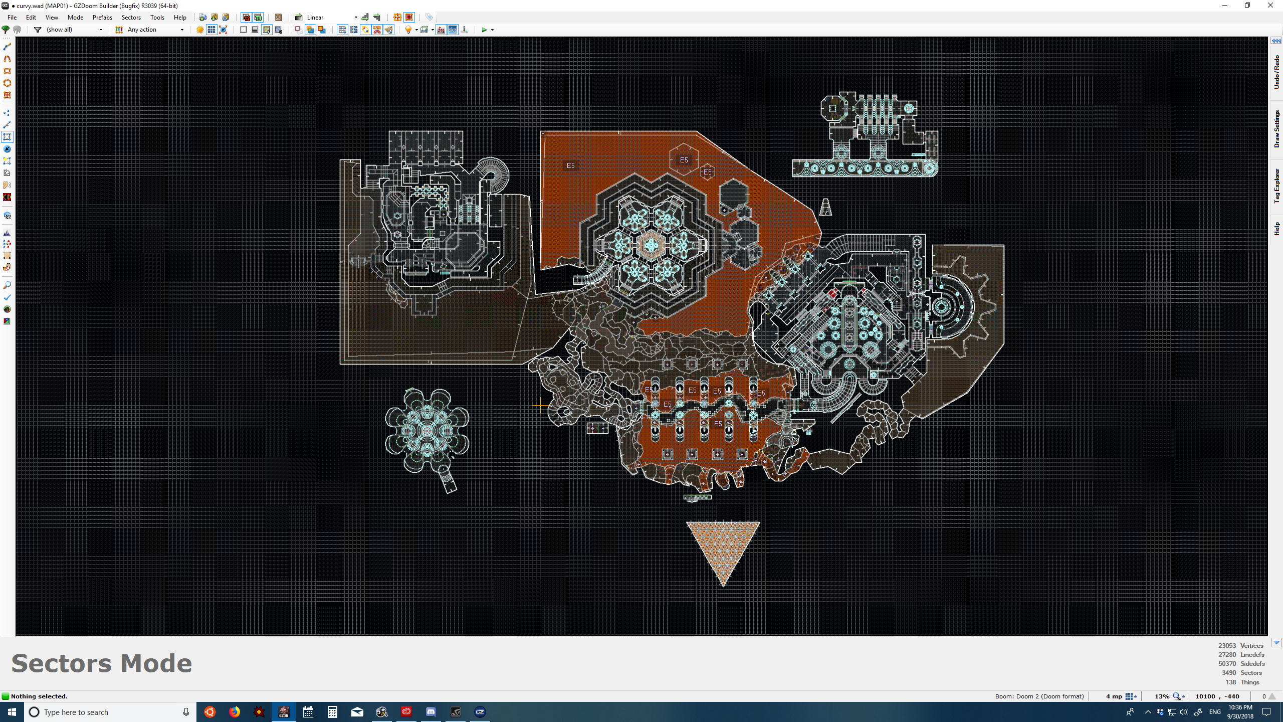
I drew a gargantuan heptagram on a map and started to add in the existing pieces according to my paper sketch plan. The map area here is about 34000 units across.
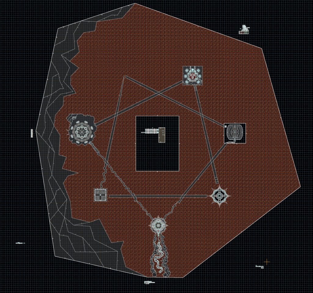
The walkways were just straight lines at first, and I roughed them up manually. First the contours, then I segmented them to make shifts in elevation, and only in the final weeks did I add the little trim indentation for all of them.
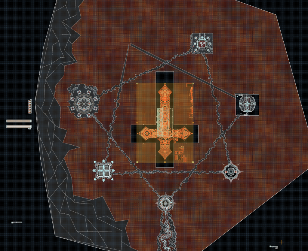
It was immediately clear that this was an terrifyingly daunting undertaking. The very crude terrain seen above left has many lines exceeding 1000 map units in length, and just making the walkways a bit more natural and squiggly took many hours.
I hit the sidedef limit on November 13th (and might have done so sooner, but I don’t have a screenshot older than this), so the last month of development was a constant fight against the boundaries of the map format.
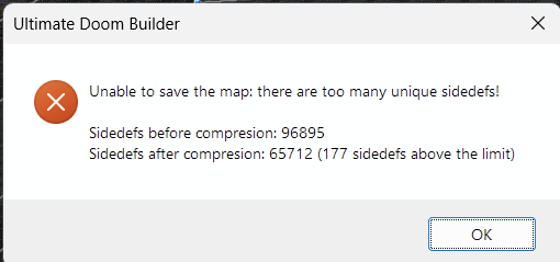
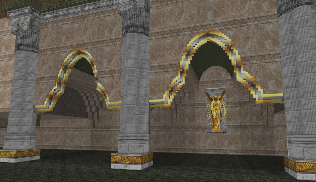
One thing that had to be simplified is the final fight room, where I originally had these ridiculously elaborate sector arches:
What didn’t make it
From the beginning the idea was not to have the level be empty, but instead to have imps on cliffs all over the map, so that there’d be a constant torrent of hundreds of fireballs coming towards the player. This would look cool in such a giant space, I thought, and it’d force the player to keep moving. What made me abandon this idea was mostly that they were incredibly annoying to kill even once you had all the weapons. I had to build these little imp islands close to the walkways for vertical autoaim to even have a chance of working, and it just looked wonky. I was really disappointed in this at first, but other people in the team pointed out that the emptiness actually felt better, and eventually I began to agree.
I also had plans for a huge swarm of flying enemies—Cacodemons and their variants—descending like a storm over the map once you had finished all the towers, but that went against the idea of the landscape being entirely dead.
Lastly, there are two little red brick ruins in the map. They’re a remnant of a plan to have a whole secondary quest happening off of the walkways. I wanted to make more of these scattered throughout the level, but I ran out of time and linedefs, plus the map doesn’t need to be any longer than it already is. It’s a bit of a bummer most players reload a save or rewind if they fall off the walkways because I did my best to provide escape routes everywhere. Bauul helped me tidy some of these up, big thanks for that! Thankfully that aspect of the map at least gets shown by the blind saveless crowd on Youtube etc.
Some notes on the individual fights
First tower: Berserk
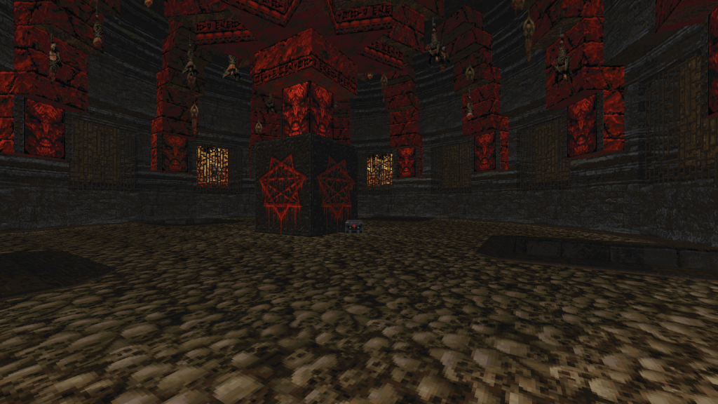
This was an existing set piece I had built some time in 2019-2021 as part of practicing combat oriented design. I’m not sure how I came up with this, but forcing movement via the circle of arch-viles and combining it with the forced movement inherent to melee combat felt like an interesting setup. I had the lifts moving slower at first, which was aesthetically more pleasing. But since I want to kill all the viles with the last switch and Doom can’t interrupt an ongoing sector movement, the killing became very unresponsive and janky. Dragonfly increased the lift speed and this made it a bit more stable.
Early release versions had spectres appear after the viles died but they provided no real challenge so I removed them. Revealing the vastness of the rest of the level is a more powerful experience.
I had a less exciting exterior design of this building originally that Dragonfly changed into the big spikes it has now. I retextured this something like 12 times during development, and I think it even changed post RC1 as I could never make my mind up.
Chaingun arena
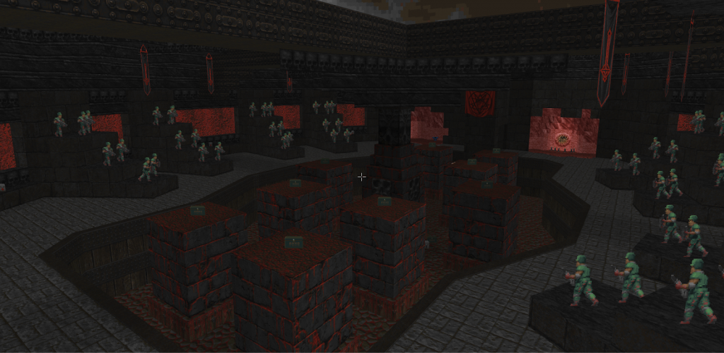
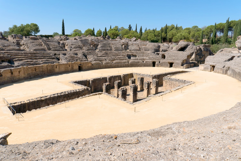
On one of my countless hunts for texture inspiration I came across a picture of the Trsteno Arboretum north of Dubrovnik, and I immediately felt it’d be neat to be hunted by Arch-Viles here while other enemies fire at you from above on the sides.
My first setup had Barons and Hell Knights on the sides, and was visually very crude. I struggled a lot to make this look interesting, and Dragonfly came to the rescue: He gave me some ideas for the interior which I ended up drawing a lot of inspiration from, and he actually built both the monster closets for the hitscanners and the exterior of this tower for me, as I was so pressed for time.
Changing from hell nobles to Former Corporals gave the fight a dynamic that felt much more exciting, and their ambient sounds before you pick up the chaingun make for a deliciously evil atmosphere.
Somewhere around RC4 or so I made an update that spawns more Arch-Viles here the more weapons you’ve acquired, since arriving here with rocket launcher and plasma rifle makes two AV’s trivial to dispose of. A huge advantage of releasing a level via such a high profile project is that you get to see so many players tackle it. I hadn’t realized you could go here after you get the plasma rifle but seeing it on streams made me add this balancing tweak.
The swarms of cacos and lost souls plus the huge wave of hitscanners that appear when you press the flesh switch to get out aren’t super fine tuned, nor very difficult. Adding more cacos didn’t bump difficulty in a meaningful way, but made cleaning up super tedious if you just have the chaingun. So eventually I just felt it was good enough and moved on. With more time at my disposal I think this phase could have been made far more memorable.
Ultimately I think this is an intriguing fight; You can raise the floor to make it more likely that you get help killing the AV’s, but that also puts you at risk as well. And again player movement is enforced simultaneously by AV’s and another threat.
Super shotgun arena
This is an area I made in 2018 when developing OTEX. I posted this screenshot on Doomworld in March of 2018, a week or so before development of the original Eviternity began:
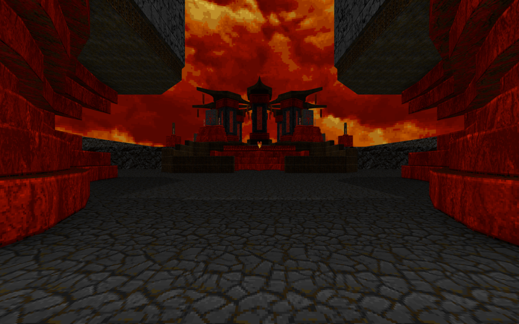
Out of all the fights in Kenosis I think this is perhaps the weakest, primarily caused by it being a visual design first with gameplay tacked on later. You can just circle on the outside and never be in much danger, but what I wanted was to force the player to go through the middle occasionally. Ultimately it’s still a good idea to do so since the Annihilators then start infighting the other monsters, and most of the time only 1-2 Annihilators remain at the end, weakened and easy to pick off.
A lot of players miss the flesh pillars lowering after you shoot the pod, but I think a bit of confused running around is on brand for the level so I gave up trying to improve the signaling.
The SSG is (unsurprisingly) more useful in subsequent fights than the chaingun, so this is the one I made mandatory for progression.
Northeastern rocket launcher arena
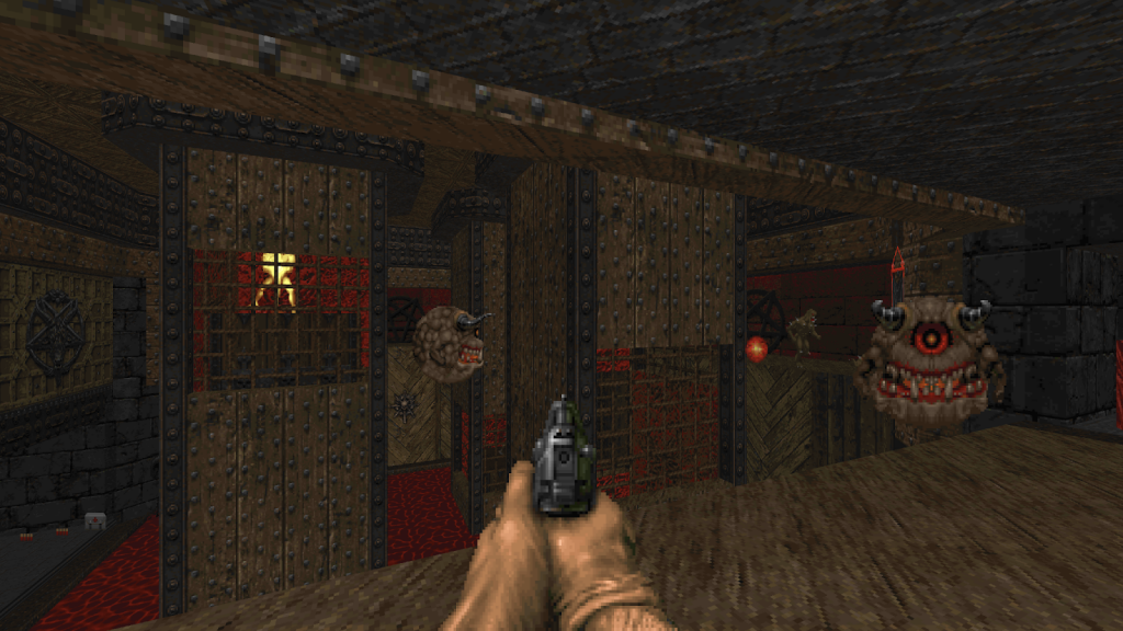
Possibly my oldest setpiece in here, again using Arch-Viles in lifts. With their windows at varying heights pointing in different directions there’s a panopticon idea at the core here, something I revisited in a later fight as well. Ultimately the viles aren’t much of a threat once you get out, which I could have fine tuned more, but I think it works well enough.
Even though I thought this was fairly complete as a standalone setpiece, it saw a lot of fine tuning once it was placed into Kenosis. For a long time, killing the viles had cyberdemons replace them, but it didn’t make the fight more fun and disposing of the cyberdemons was tedious. Also, pushing the player to jump into the blood pit via the first AV, the extra chute that opens up later so you don’t get blocked in by revenants, ammo and health balance, how the outside fight unfolds as you press the two switches for the rocket launcher, was all done after I placed this into Kenosis.
It doesn’t seem to really be anyone’s favorite fight but I’m quite satisfied with it overall. A combination of set objectives—the 3 switches for the lifts, then lowering the them all to get outside, then the two switches for the RL—and free roaming combat with a wide variety of monsters, all came together to form almost a little mini level rather than a singular setpiece.
Out of the two rocket launcher arenas I decided to make this one mandatory for progression, via the inclusion of the flesh pod.
Western rocket launcher arena
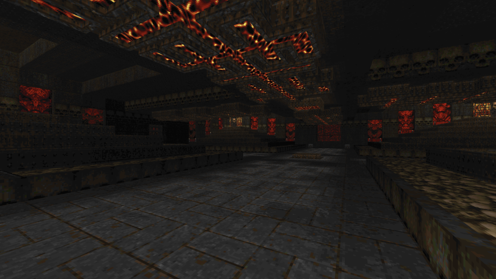
In Anagnorisis I had added the massive swarm of lost souls to the magenta room on a whim in the last few days before release. It became a very memorable moment and knew I wanted to add a little nod to that in here. So why not step it up to 1024 lost souls?
I first built this as concentric circles, with the idea of lowering them one by one to squeeze consecutive gasps of “what the fuck!” from the player. But I had painted myself into a corner in terms of visuals so started over with a square design. Dragonfly ended up adding some needed details to the Lost Souls platforms and outer walls, which I’m very grateful for. The ceiling with the lava (and most of the texturing actually) is a rather obvious nod to Quake.
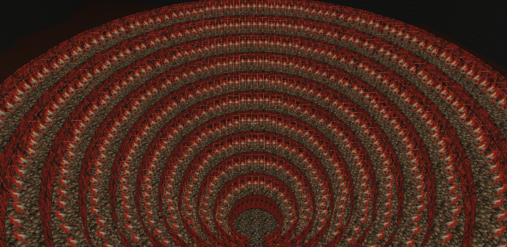
I had also seen some of the voodoo doll comedy Tristan was playing with (for map32, among other things), and came up with the idea of yanking away the invulnerability sphere from the player with the mini cutscene sequence as you enter. This kind of environmental storytelling is something I’d like to take much further (and I suppose I did, too, for the final fight) but a lot of players watch behind themselves as this happens, missing the sequence. Oh well.
Briefly this had Arch-Viles in all four corners but that felt bullshit-y. It’s still annoying to kill the monsters in these cages, I should perhaps have prevented them from stepping in behind the pillar. But the elevation here is juuust right to give you cover from one corner when you go into the next, making for very few safe spots until you start killing the viles and revs.
Ultimately I’m happy with the room, it’s quite easy unless you grab the invuln too soon (or get blocked from reaching it). I think it’s fine that this one is more of a theatrical experience than a gameplay challenge. Originally there used to be double the quantity of Veilimps outside, but that made it basically the hardest fight in the whole level. Despite the change, it still gives a lot of players trouble.
Northern plasma arena
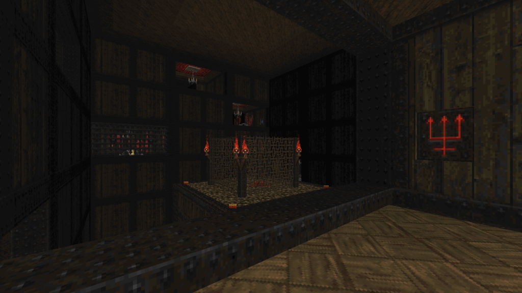
Other than the entrance, repurposed from another 2018 mapping doodle, this was made specifically for this level and built in place rather than pasted in. I always loved most appearances of WOOD5 in the IWAD levels and wanted to build something around my OTEX interpretation of that texture, OWOODI22. Some hallucinated amalgamation of IWAD memories informed this design, and quickly morphed into having to traverse upwards by raising a central platform.
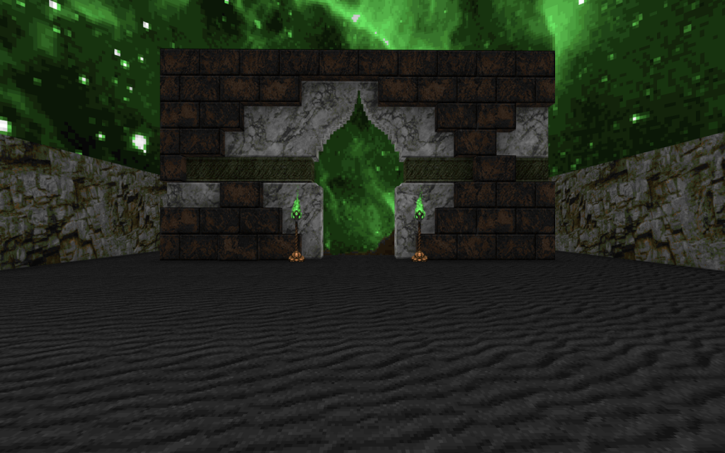
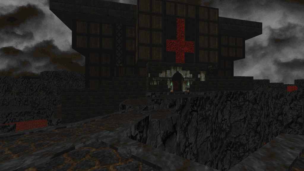
The first idea was a Spider Mastermind in the center but a Cyberdemon worked better. The plan was that you’d have to use the boss enemy to kill the Astral Mancubi so that you could progress, which is why there are still backup cyberdemons. But in testing I found the more logical flow was to merely instigate enough infighting to distract the monsters. I also rebuilt this whole arena from the ground up several times since I ended up with a scale and grid that didn’t work too well for the progress flow, sight lines, and jumps. Here’s an early version with the Spider Mastermind, November 8th (32 days from release):
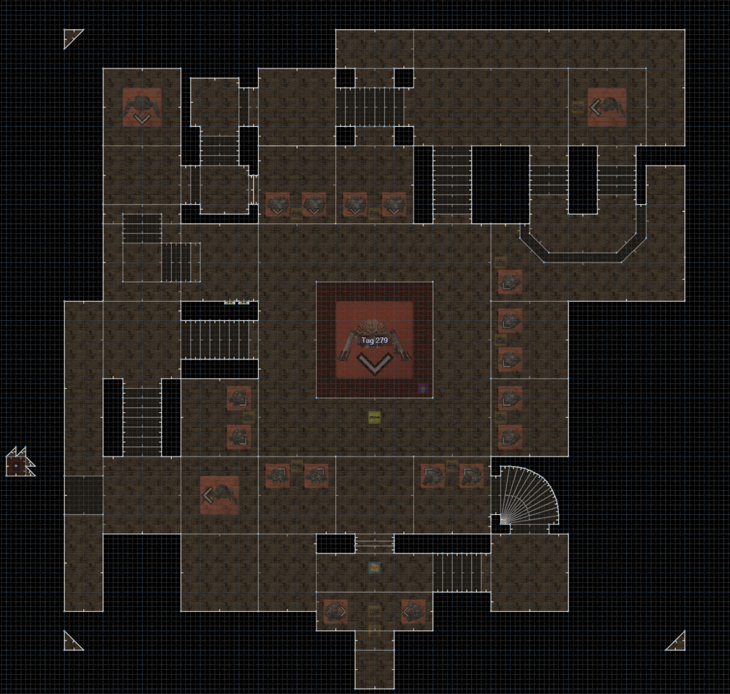
There was a lot of fine tuning here for lines of sight, the gates that require the blue key, and getting the flow right. It’s still perhaps the most cryptic progression of all the fights but still fairly self explanatory given a bit of time. The constant threat in here is something I’m happy with. Weak points might include a couple of the Astral Arachnotrons not really posing much of a threat, and visually this could have been more elaborate had I not run out of lines. In fact the fleshy indentations in the walls just abruptly stop after a few rooms in here, since the map format prevented me from adding more.
The clever voodoo doll stuff to create the sine-wavy motion of the flesh exposed in the walls was constructed by Dragonfly.
Southern plasma arena
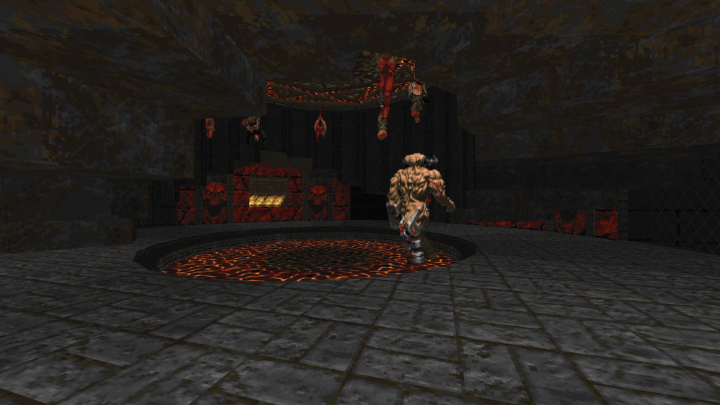
A circle of perpetually moving sectors will forever be associated with Sunlust map29 and I suppose the inspiration for this has that same lineage. I got a bit lucky with the size and speed here and it just happens to work great with plasma and a cyberdemon, I didn’t really have to tweak much. This too is a setpiece I built right after Eviternity.
What I did change were the Mancubi, as there were originally 4 in each chamber. That was a little too spicy and also boring to clean up. The surrounding rooms that open up had a lot of different enemies before I just settled on Dukes of Hell; Anything I place here gets crushed anyway if it can fit through the openings so it’s more to scare the player than to provide an actual gameplay challenge.
I had built this setpiece long before I saw the far more elaborate inverse crusher path in Insane Gazebo’s incredible map32 of Fractured Worlds. And during Eviternity II development, Aurelius showed me a setup with two concentric circles of crushers he had already built (but ended up excluding from map14):
Those two were so much more advanced and spectacular than my setup that had I not run out of time I would have scrapped this. But it turned out OK all things considered.
The cross: Southern section
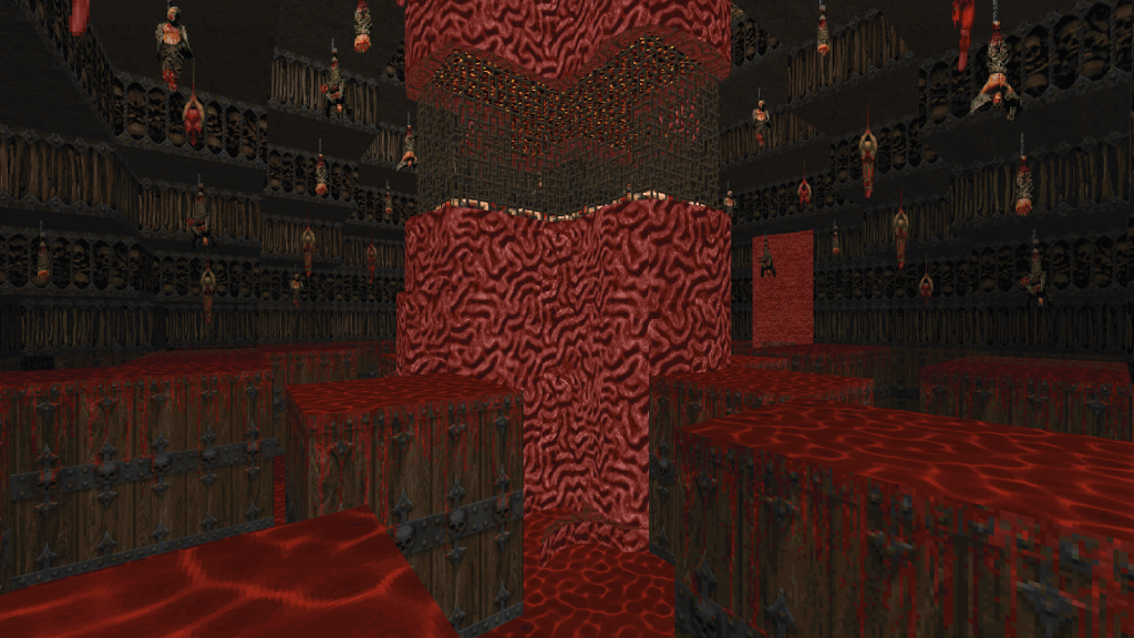
This is an idea repurposed from korset.wad: A grid of sectors that raise or lower to form different patterns, and each pattern comes with a new set of enemies. In the original I wasn’t using Boom but instead some migraine inducingly complex control sector stuff. It was also 64×64 sectors instead of 128×128, and to make matters worse they were at a diagonal which hurt monster movement quite a bit:
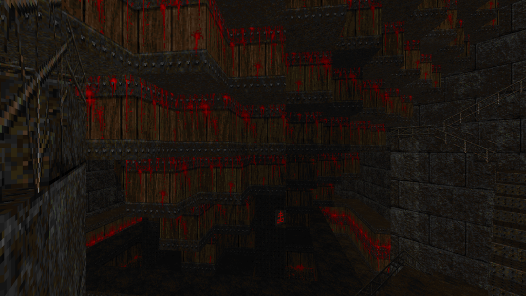
The core concept remains though: A maze with a constant Arch-Vile threat from a central panopticon pillar, switches that alter the layout and release new monsters, and finally getting to fight the viles.
When I built this I was already bumping against the sidedef limit every time I tried to save so I was extremely conservative with detail. The custom texture on the upper walls is actually an edit Dragonfly did. I added the running blood to the wood texture for a bit more detailing without having to add lines.
I have a couple of things I’d have liked to improve in this fight. First, I ended up making the viles get killed instead of being released. The reason is I had to cram as many in there as possible to hopefully tell the player “you’re not meant to kill them all” (which some managed to do anyway), but then releasing that many makes for an incredibly hard fight. In retrospect I could have tried a low invisible wall to preserve their line of sight while blocking incoming rockets from below, or changed the floor raise/lower pattern to provide enough cover to pick them all off once released.
The last wave, all pinkies, was originally Nightmare Demons. If you were out of plasma that meant certain death, and there was no good way to tell the player they should preserve plasma so I changed it. But pinkies offer basically no threat so this part is a little… meh.
Lastly, the room ends with the moving blocks having formed 4 pillars, each 256×256. I wanted to make a Dead Simple homage by putting an Astral Mancubus on each, but ran out of both time and lines, plus it felt like the room dragged on for long enough anyway.
The cross: Eastern section
This is a room I made in the summer of 2017 as part of OTEX development:
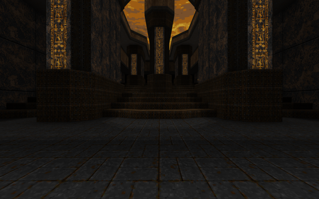
The cross: Western section
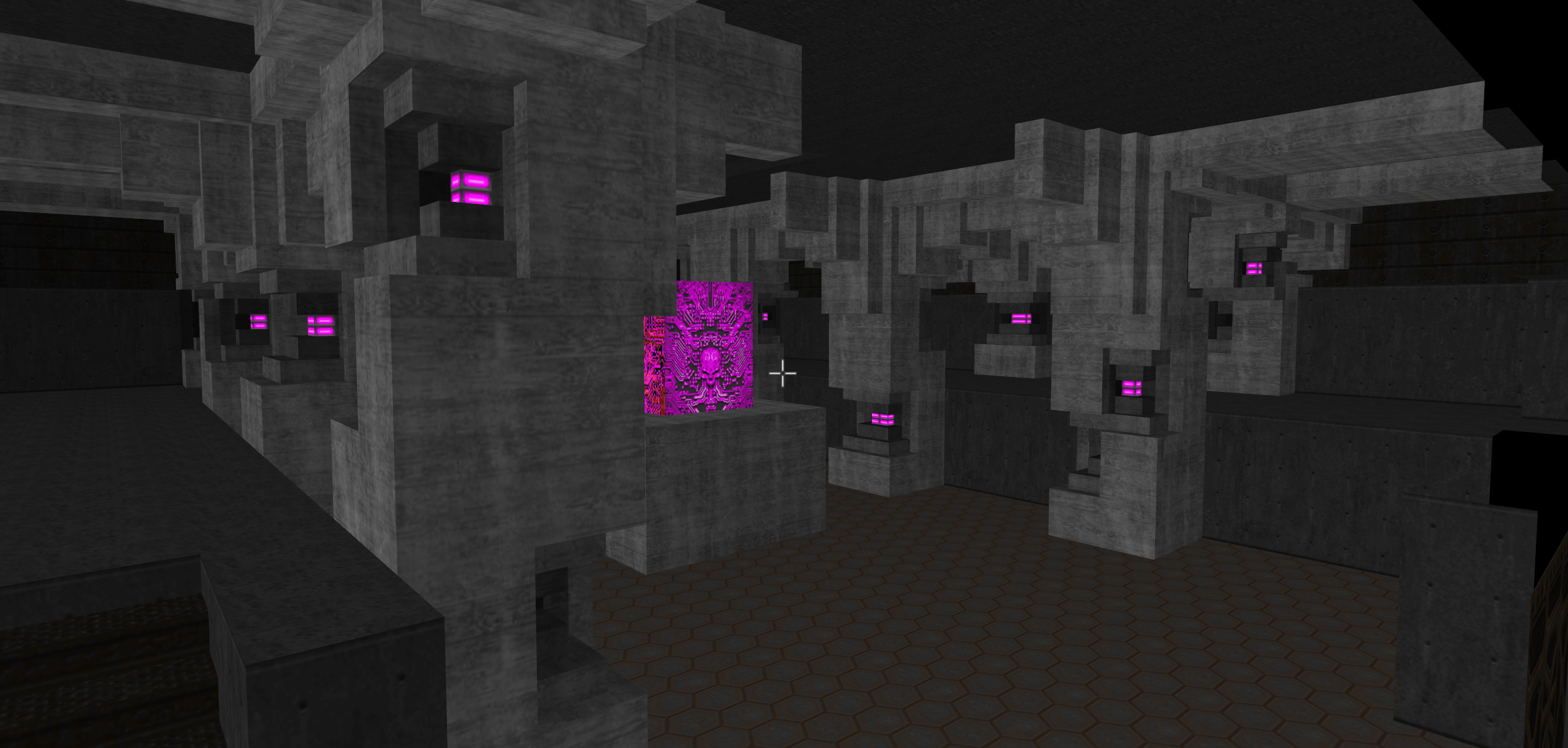
Here Dragonfly didn’t just do the monster placement, he actually built most of the room. I was so insanely pressed for time and needed to fill out the cross, so I sent him some old texture testing scraps and he took these pillars and ran with it:
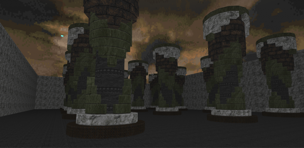
This fight used to have an enormous swarm of Astral Cacodemons but surviving that required some rather un-fun monster herding. In its final form it plays well though, fostering efficiency in movement, resource management, and kills. So perhaps its gimmick is that it’s the one fight free of gimmicks.
Dragonfly also made the central room in the cross building, but other than the comedic relief of 5 infighting Annihilators (which I added not realizing they’d just immediately turn on each other), it doesn’t have any combat so I won’t address it further.
The cross: Northern section—final fight
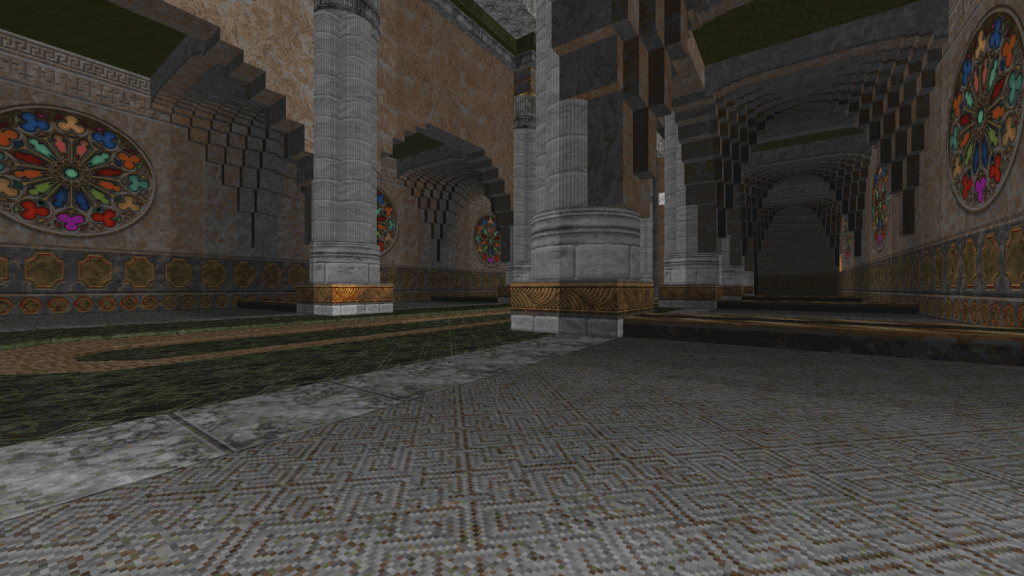
This was an idea I’ve had for many years, originally inspired by a 90’s map that I forget where it’s from—it uses crushers on barrels to hurl former human gibs out through holes in a wall. (If someone knows what level this is, let me know!)
This was then combined with a little test I built in 2016 or 2017:
I did want the whole fight to start with the player shooting the cross like in that video, but it proved too cumbersome to block mouselook players from starting the sequence too soon while also making it intuitive.
For a long time I had the mental image of a rather dark church, rather than the more bright and heavenly setting I ended up using. I think some of the church-like sections in the one-man megawad Bloodstain (which I consider often overlooked; It’s got some incredible designs) sat at the back of my head when conceptualizing this. So the plan was stained glass windows breaking, showing some hellish flesh instead, and then corpses flung out. Once that’s done, release the arch-viles.
My plan was to use imps, but that change when the Perforator weapon was made to use bullets. That gun was my idea from the beginning, and the idea was a weapon that could one-shot Arch-Viles but has a long reload time; If you miss, you’re in deep trouble. I had this particular setup in mind when I thought of that idea, so the two are literally made for each other.
Bauul didn’t just design the behavior of the weapon as implemented, he also made the breaking glass effect in the last few days prior to release. I had wanted something like that for the longest time, but forgot to even bring it up amids all the stress towards the end. But what he made fit perfectly, and adds a lot to the drama of the scene.
With the Necromenace mini boss and its resurrection ability, it felt logical to include them too. In map25 they’re technically two different monsters triggering different tags on their death, and for Kenosis we made two more since the space warranted more of them. Some custom textures were needed to help the scene feel more complete: the stained glass windows, the walls with their trim, and the massive animated exit portal inside the cross.
The conveyor belt throwing former humans across the kill floor to gib them would have had a single steady stream with all the corpses landing in the exact same spot if not for Tristan’s conveyor witchcraft: He built a reference design for a variable length and spread “gib faucet” that I based my design on.
As a fight it’s really tricky right at the start—stand in the wrong place and you get obliterated quickly—so I added a second wave of viles after the Necromenaces are dead, to prolong the challenge a little bit. The inclusion of two Spider Masterminds and a Cyberdemon was kind of an afterthought, but them being the original big bosses it felt right to have them in such a climactic fight even if in practice they don’t pose much of a threat.
I wanted to do much more with the gradual corruption of the space but again time and linedef constraints forced me to compromise. And in the end it seems the room is getting the reactions I wanted.
Name and meaning
The name of the level combined with its overall aesthetics and not least its finale provide a lot of fodder and wiggle room for interpretation. There’s been some speculation on Doomworld and in Youtube comments on the meaning, and for the most part they’re circling my original intent. Combined with the intermission screen text throughout Eviternity there’s a little more to explore as well. But whether anyone manages to intuit exactly what I had in mind is irrelevant: What this level means for me will never be what it means for others, which I suppose is true for all creative works. And a little bit of mystery here is perhaps part of the design.
Closing words
Ultimately I’m proud of the level but its high density of compromises means I’m less satisfied overall than I was with Anagnorisis. On a technical level it’s got some neat stuff I hadn’t done before, and it uses every single linedef and sidedef allowed by the map format. You literally cannot add a single vertex in the editor.
Hopefully it’s still providing players with a unique and memorable experience, something that’s getting hard to achieve with traditional designs in this 30 year old game. I hope to map more, dad life permitting, and I’ll do my best to scale back to something far more modest and manageable.
